Mimemo
App & Responsive web design
ROL
UX/UI Design
Diseño visual
Branding
Research
GOAL
Crear una App que ayude a los usuarios a ser más conscientes de su vida y producirles una nueva perspectiva.
CHALLENGE
Debemos diferenciarnos de muchas otras Apps similares que hay en el mercado.
Conocer al usuario
Research
y auditorías.
Hemos realizando entrevistas a nuestro público, en este caso eran personas entre 25 y 40 años con un trabajo estresante que quieren practicar mindfulness.
También hicimos una auditoría competitiva para investigar a nuestra competencia y ver sus debilidades y fortalezas. Encontramos que muchos productos tenían una calidad de diseño visual mejorable y una gran cantidad de anuncios.
Historia del desarrollo
El proceso
de diseño.
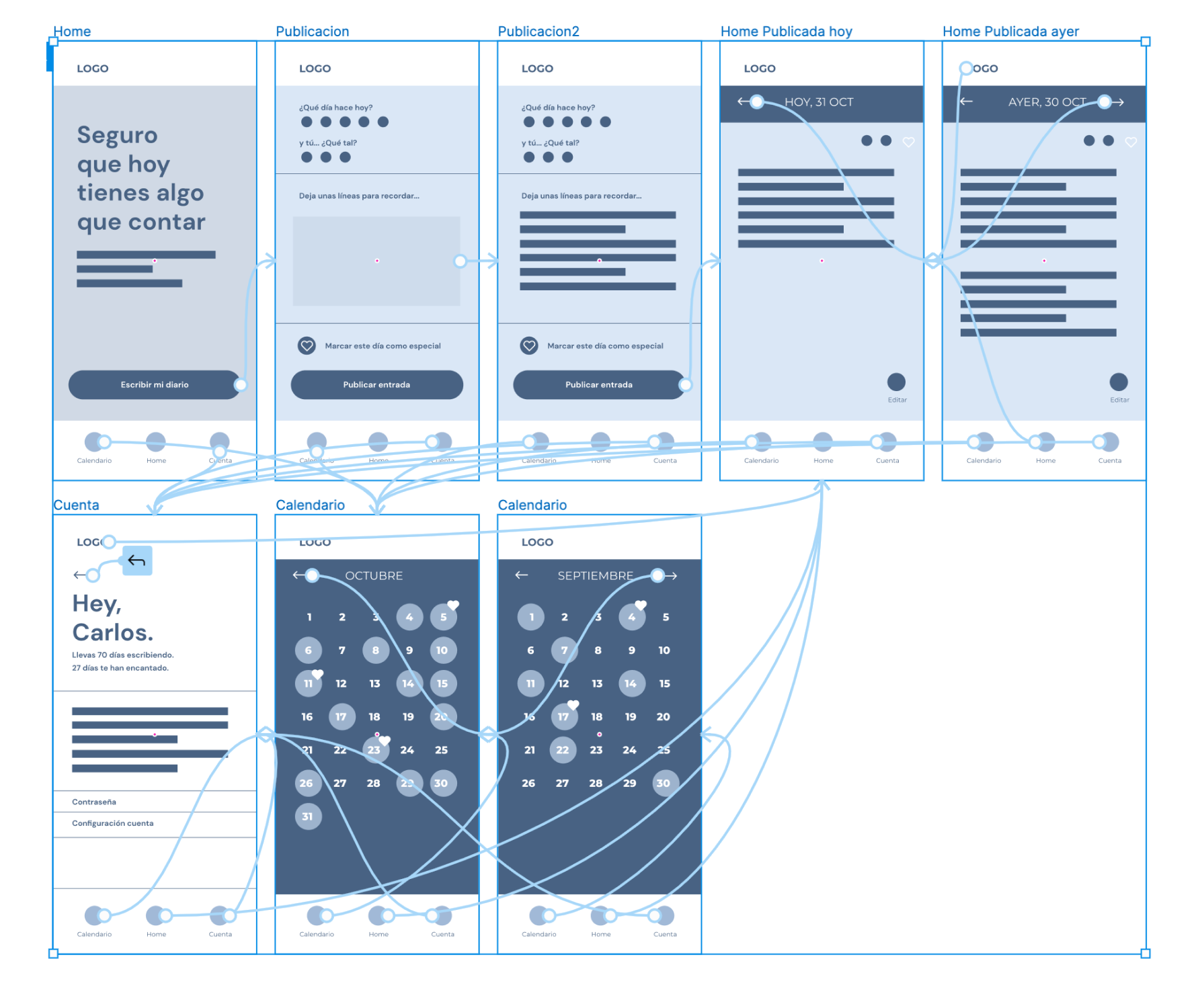
Ideamos el mapa de la web y distribuimos la información para crear un producto lo más sencillo posible, que pudiese ser usado en cualquier momento.
Comenzamos el diseño de los wireframes en papel y posteriormente, digitales, ya con las ideas a limpio.
Teníamos que probar nuestro producto, así que hicimos el estudio de usabilidad no moderado con los prototipos de baja fidelidad.
Descubrimos algunas cosas que no esperábamos, se les hacia aburrido, así que creamos algunas animaciones de transición.
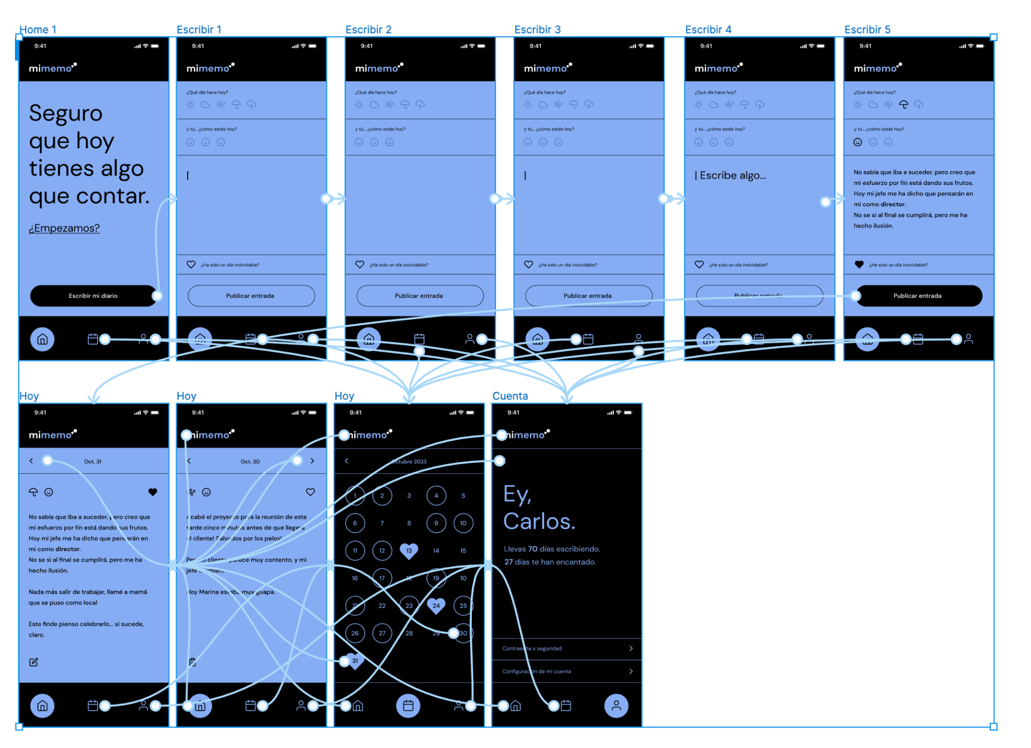
Después de probarlo de nuevo y comprobar que los participantes completaban la tarea asignada comenzamos el desarrollo de la UI, la parte más visual.
Y seguramente ya sabes lo que sucedió… volvimos a testear el prototipo de alta fidelidad.
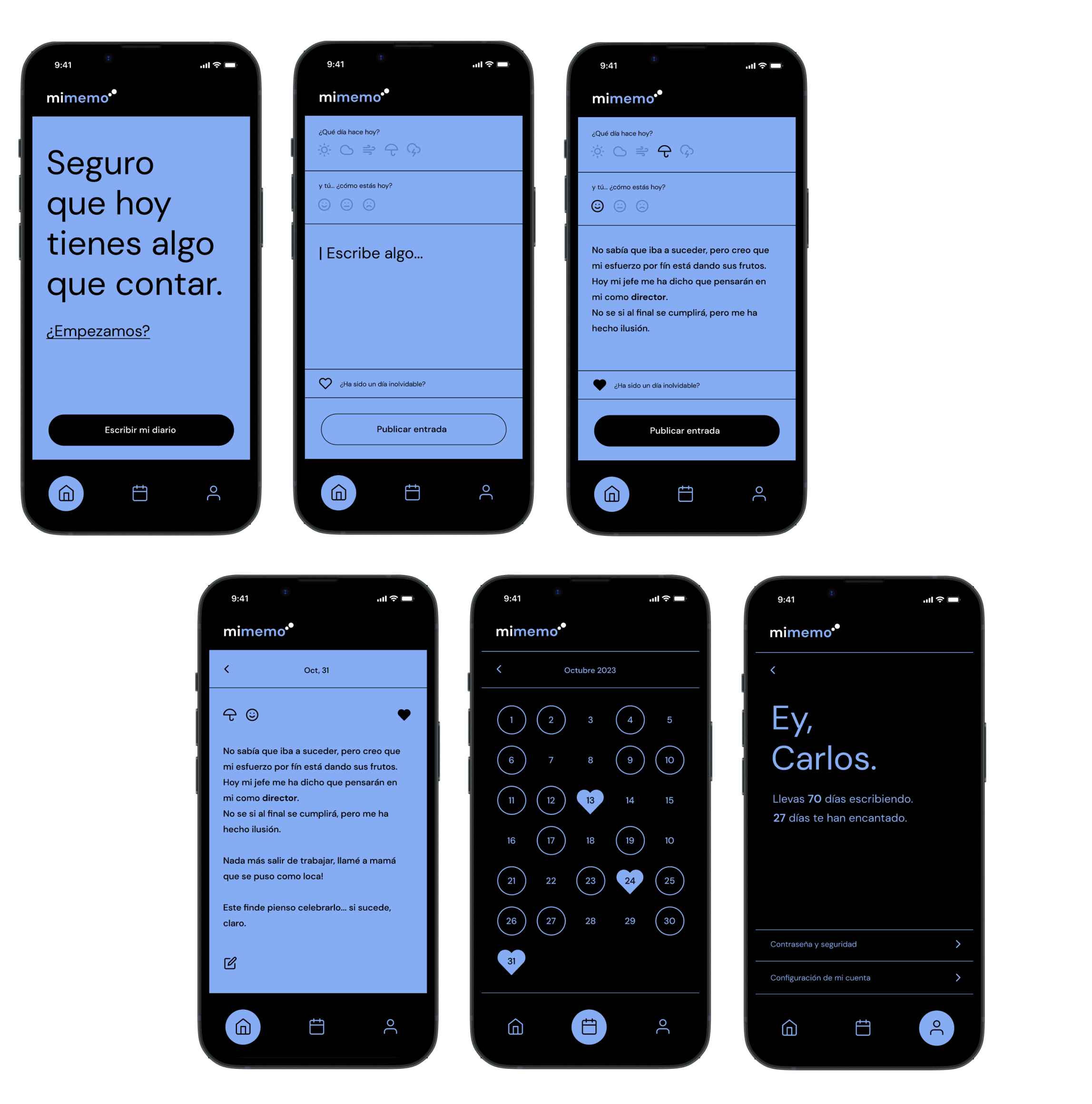
Resultado
Vídeo del Prototipo.
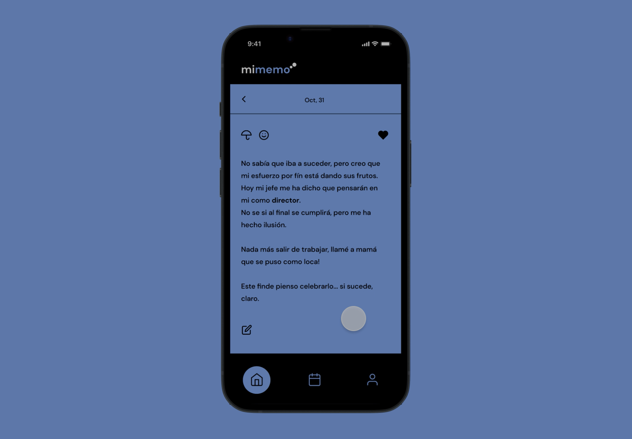
Presencia online
Responsive
web design.
Ya tenemos nuestro producto testeado y preparado
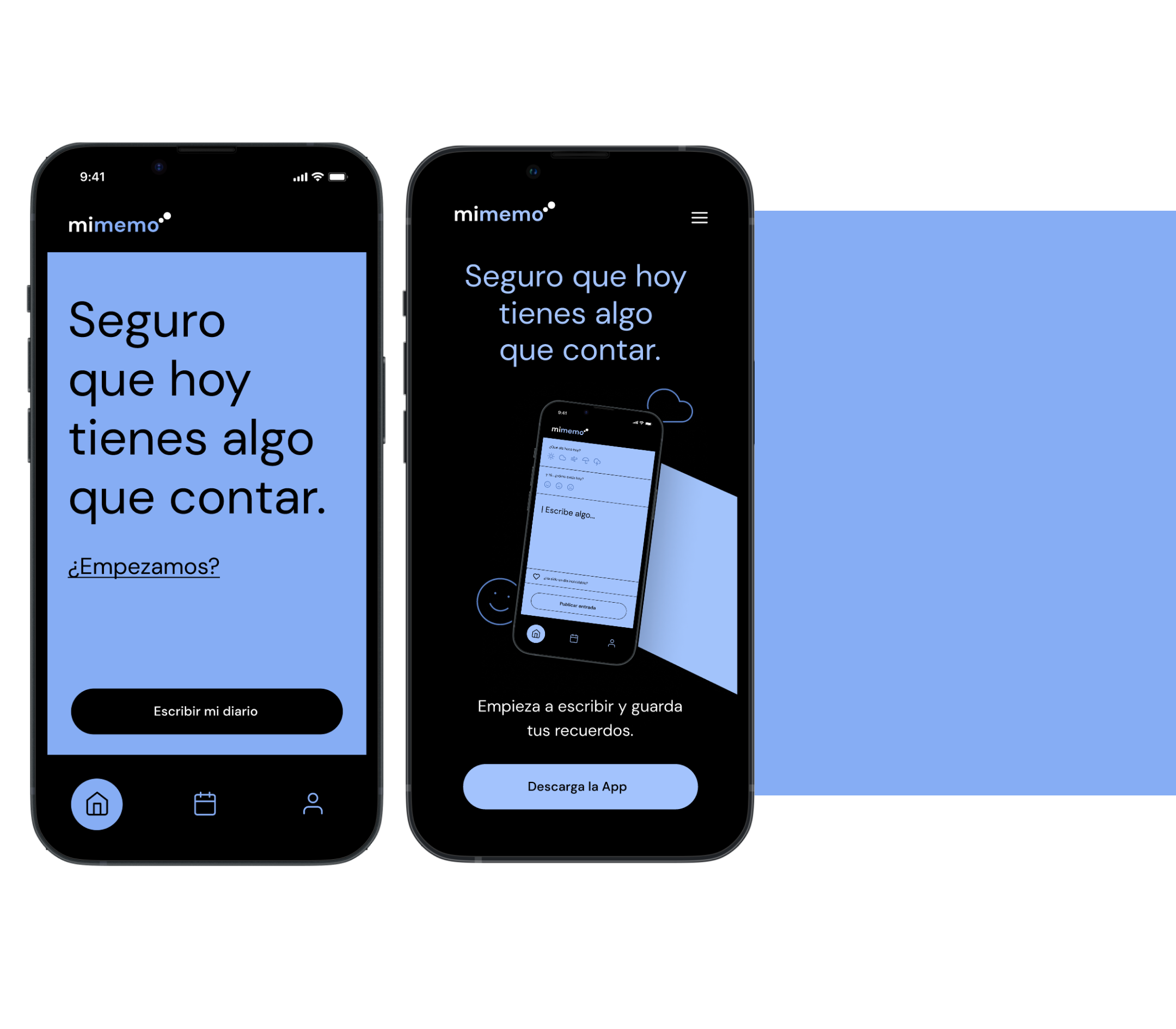
pero necesitamos crear su presencia online desde donde los usuarios puedan acceder a Google Play o Apple Store para conseguir su nueva App.
Aprovecharemos este espacio para promocionar los beneficios de nuestra plataforma, publicar reviews y algunos datos que le den valor.
Necesitamos que esta web esté disponible para distintas plataformas y tamaños de dispositivo, por lo que necesitamos que sea responsiva.
Al cambiar la plataforma hemos tenido que modificar la apariencia o disposición de los elementos para facilitar la usabilidad.

El Resultado.
Lo que he aprendido
En la creación de esta App hemos tenido algunos problemas con el color de fondo. Al final lo probamos y vimos que tenía el contraste suficiente y era accesible.
Sobre la web de producto lo más complicado fue hacer que luciera igual en dispositivos diferentes y que a su vez se relacionase directamente con la estética del producto.
Siguientes pasos
Como pasos a seguir, queremos crear una nueva función de filtro y crear la opción de personalización de color de fondo para que estés donde estés puedas ajustarlo a tus necesidades.
Una vez realizados estos ajustes, volveremos a testear.
More Work
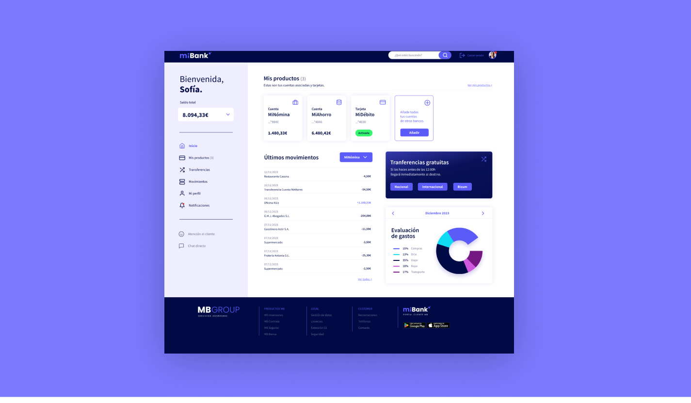
MG Group
Responsive web design
UX/UI / DISEÑO VISUAL RESEARCH