MG Group
Responsive web design
ROL
UX/UI Design
Diseño visual
Branding
Research
GOAL
Crear un portal de cliente donde la información parezca veraz y puedas completar tareas sin generar frustraciones.
CHALLENGE
Crear un diseño límpio pero a su vez lleno de funcionalidades. Necesitamos mostrar los flujos de tal manera que parezcan fáciles de completar.
Conocer al usuario
Research
y auditorías.
Comenzamos nuestro proyecto realizando varias entrevistas a nuestro target, en este caso eran personas entre 28 y 50 años que son clientes de bancos online. Muchos mostraban tedio hablando de la App de su banco y lo desagradable que les resultaba no comprender la terminología o no encontrar las funciones que necesitaban.
También hicimos una auditoría competitiva para investigar a nuestra competencia y ver sus fortalezas y partes mejorables.


Historia del desarrollo
El proceso
de diseño.
Comenzamos nuestro proceso ideando el mapa de la web. Con ello podemos distinguir cuales son las paginas más importantes y como acceder a ellas.
Decidimos comenzar diseñando el portal web
que luego adaptaríamos a la App del cliente.
Dibujamos los wireframes en papel y cuando averiguamos que partes parecían funcionar mejor realizamos el trabajo con las herramientas digitales.
Creamos prototipos de baja fidelidad para hacer un estudio de usabilidad no moderado.
Los participantes pudieron completar el flujo de transferencias sin errores remarcables o sentimientos negativos destacados.
Comenzar a trabajar en la UI diseñando las maquetas de alta fidelidad de nuestro producto.


En las maquetas vemos como es el flujo de transferencias, ya con los colores y estilos de la marca, para ver la interacción hacemos los prototipos de alta fidelidad.
Para poder comprobar su funcionalidad realizamos un nuevo estudio de usabilidad y comprobamos que la experiencia se completa sin problema.
Como nuestro producto funciona desarrollamos el diseño de la App y vemos como los elementos continuan siendo coherentes y mantienen el estilo de la marca.
Al cambiar la plataforma hemos tenido que modificar la apariencia o disposición de los elementos para facilitar la usabilidad.
Al mantener la coherencia entre productos reafirmamos la marca y creamos una continuidad entre su uso en diferentes plataformas. El usuario percibirá nuestra marca como sólida y profesional.

Resultado
Vídeo del Prototipo.

El Resultado.
Lo que he aprendido
Al adaptar un producto a otras plataformas debemos ser conscientes de que el uso de esta plataforma es totalmente distinto, tanto en contexto de uso como las opciones que ofrece el dispositivo e influirá en la experiencia que tendrá el usuario.
Por ejemplo en el ordenador necesitarás tu contraseña para verificar el proceso mientras que en tu móvil podemos desarrollar un sistema Face ID o Touch ID.
Siguientes pasos
¡Ya tenemos el flujo de transferencias! … pero esto no acaba aquí. Necesitamos volver a testear nuestro producto e incorporar nuevos flujos… y seguir probando.
More Work
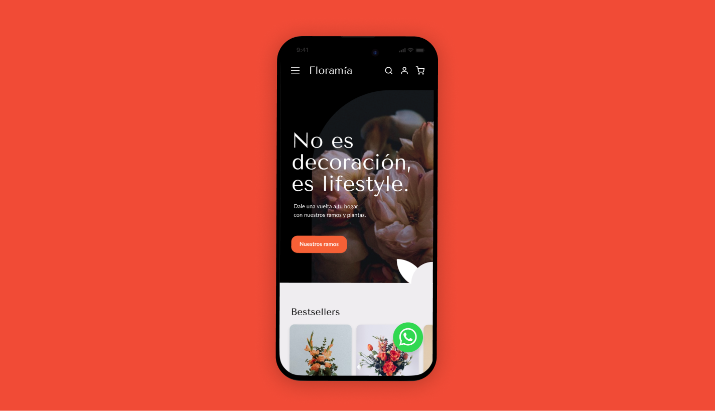
Floramía
Tienda online
UX / UI / DISEÑO VISUAL / BRANDING / RESEARCH